Helpful Guidelines for DarkMode

Ensuring Visual Clarity and Consistency in Every Shade.


6 THINGS YOU SHOULD KNOW
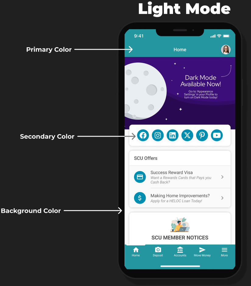
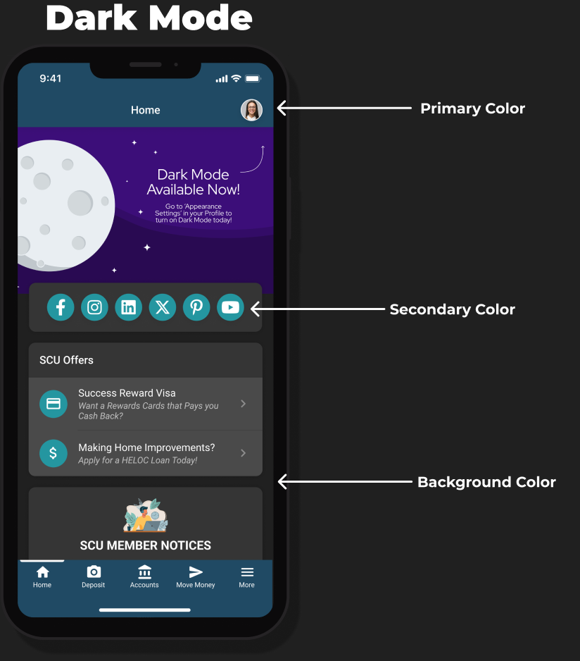
- Dark Mode is now available across both Desktop and Mobile products.
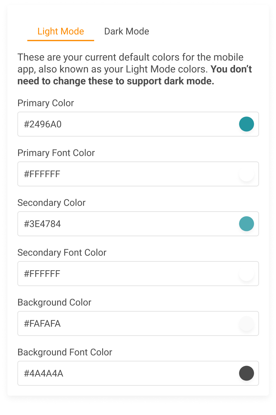
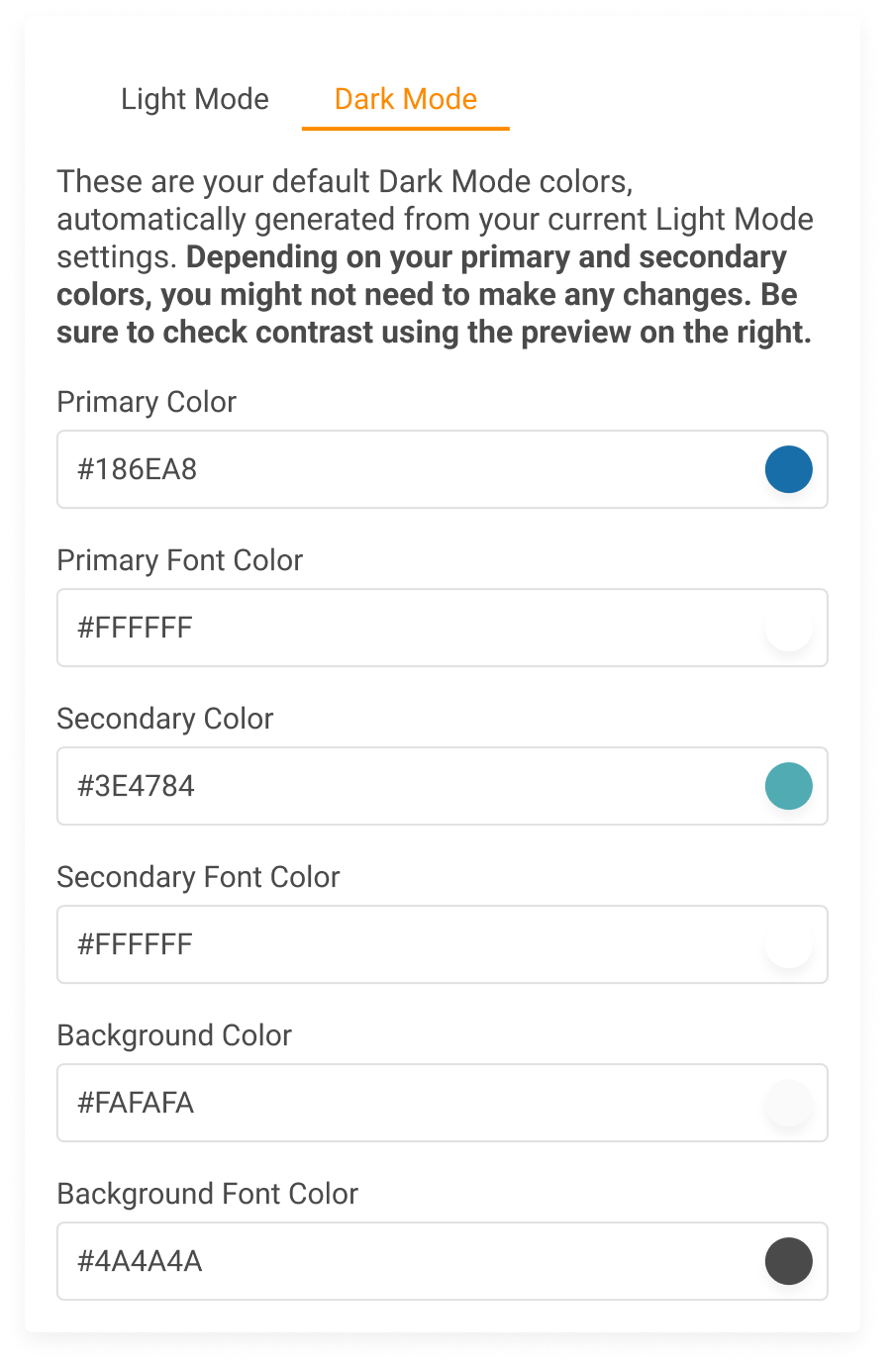
- Your existing Light Mode colors will carry over automatically — in some cases, that’s all you need!
- Elements that aren’t brandable will automatically adapt to Dark Mode styling
- Most of the time, your Primary Color doesn’t need to change for Dark Mode.
- Secondary colors may need tweaks to avoid contrast or visibility issues.
- Avoid low-contrast color combos. (See examples below!)
Example of Illegibility
Illegible
using a darker
Secondary Color

Legible
using a lighter
Secondary Color

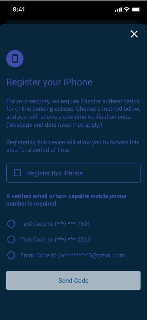
Avoid using dark or colored fonts in Dark Mode.
Colored fonts (especially dark colors) can reduce readability and create contrast issues. Stick with light, high-contrast, or white font colors to ensure text remains legible across all backgrounds.
using a dark Primary Font Color
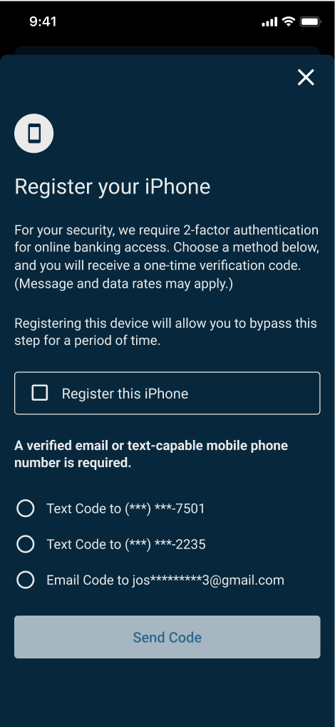
using a light Primary Font Color
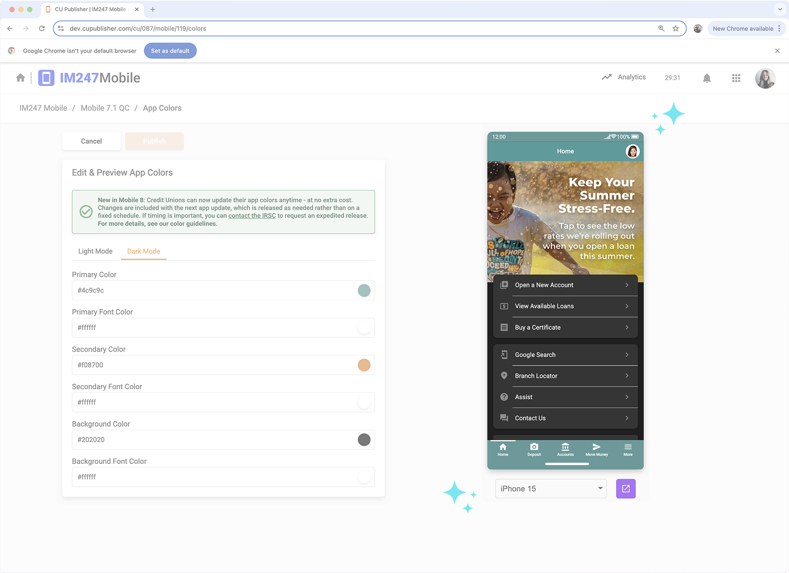
CU Publisher lets you see your Dark Mode updates in real time—perfect for catching contrast issues early.
New for Mobile 8
Dark Mode is here. Stay on trend and make online banking look effortlessly modern.
See what’s new with Mobile 8


Everything. Everywhere. In Sync.

Get the complete suite to manage every member-facing touchpoint — web, mobile, and more.

Unlock the full potential of Desktop Banking
Don’t leave powerful tools unused. Enable Dark Mode, customize layouts, and market smarter – all with IM247 Manager.


CU Publisher 2.0 • Powered By Mobile Technologies Group • Copyright © 2025 CU*Answers Inc. All rights reserved.